interiors

Modern Luxury Airbnbs in Leavenworth | Seattle Photographer

When I think of Leavenworth, I think of quaint shops, delicious sausages and beer, and epic mountain views.  Admittedly, I’m not usually throwing around words like “modern design” and “elevated interiors” when I’m thinking about my favorite little mountain town just two hours from Seattle.  However, all of this is changing right this moment with the arrival of Hara Homes.  Owner and developer Camila Borges has landed a serious slice of luxury into this town.  Like literally, right in town.  

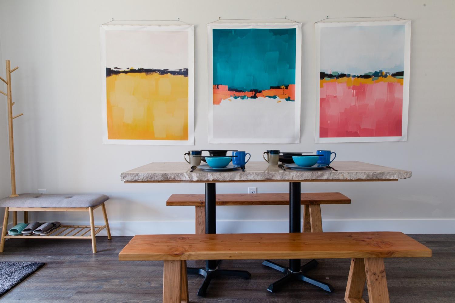
While the exterior has kept with the traditional roots of the Bavarian style surroundings, these six homes are anything but traditional inside.  Each home is a unique masterpiece of interior design and style.  Camila has exceptional taste and has outfitted each vacation rental with the luxuries you’d want on vacation with clean and elevated design.  Natural light flows into each space and the open floor plan allows for long days of preparing meals, enjoying each other’s company and getting some much needed post-pandemic rest.  These are not your average Airbnb vacation homes.  

Each home is prepared for a full family and beyond.  There are bunk rooms for the kids and beautiful primary bedrooms on both the first and second floors.  The first floor rooms are the showstoppers of design with feature walls, boutique lighting and architectural side tables.

Photographing these spaces was a unique project!  I spent an entire day on the property creating with Camila.  Running from one house to the next felt a little like the cartoon hallway of doors, and me with my gear popping in and out and over!  It was truly amazing to see the way light changed in the spaces throughout the day and to slow down and create some beautiful vignettes mixed in with capturing the spaces themselves.  It’s not enough to just have good photos of the spaces alone – when you introduce lifestyle content into your vacation rental photography it stands out.  Guests can imagine themselves enjoying your Airbnb experience when they can see it with a little help from your photographer.  It’s no wonder that professional Airbnb photos help increase your listing and earnings by 20%.  
Enjoy the beautiful spaces and book your stay here!

Mod-Zen Airbnb near Seattle

Shooting lots and lots of Airbnbs around Seattle, I always look forward to seeing each space and seeing how the owners have brought out its unique qualities to make an excellent guest space. In this vacation rental, the owners worked with a contractor to design a custom wood wall divider with sliding panels to make for a really zen feel, while also offering two sleeping spaces. The panels also filter the light really beautifully and honestly I had to resist the urge to just put down my camera and take a nap. ;) Interiors photography is such a joy for me — I get to relive all the best parts of playing countless hours of The Sims as a 12-year-old, designing and redesigning spaces. The spaces we surround ourselves with are a part of us, whether we’re living in them permanently or just airbnb-it for a weekend trip.

Hope you enjoy the photos of this beautiful space!

Washington Coast Vacation Rental | Seattle Airbnb Photographer

I’ve been following Beachhousewa on Instagram for a while now. I’ve admired the beauty of the homes and the level of attention to detail. It finally worked out for me to stay with them and to photograph their newest cabin listing, the Lewis.

As expected, it was pretty remarkable. The house is not only beautiful, but they’ve truly thought of everything from having an extensively appointed kitchen to a range of media and games to instruments to play during your stay. Best of all, it’s walking distance to the Pacific Ocean.

It was such fun to photograph this space. The abundance of natural light made for light and airy photos, and the lines in all the woodwork were so pleasing — I kept gasping behind my camera. :)

The Lewis Cabin can be rented directly through Beachhousewa here.

Renovation Reveal: Primary Bathroom

This might be the biggest transformation of our renovation project. When we first walked into the primary bedroom we were stunned by the views of Seattle and Lake Washington. We were also really surprised at the size of the room — it spanned the entire back of the house wall to wall, but it shared a small bathroom with the two other bedrooms on the top floor. We knew that we’d be adding a bathroom to the room when we bought the house. It was hard to imagine something that didn’t exist, and there was a lot of taping involved to get the idea of the scale, but in the end I’m so happy with it.

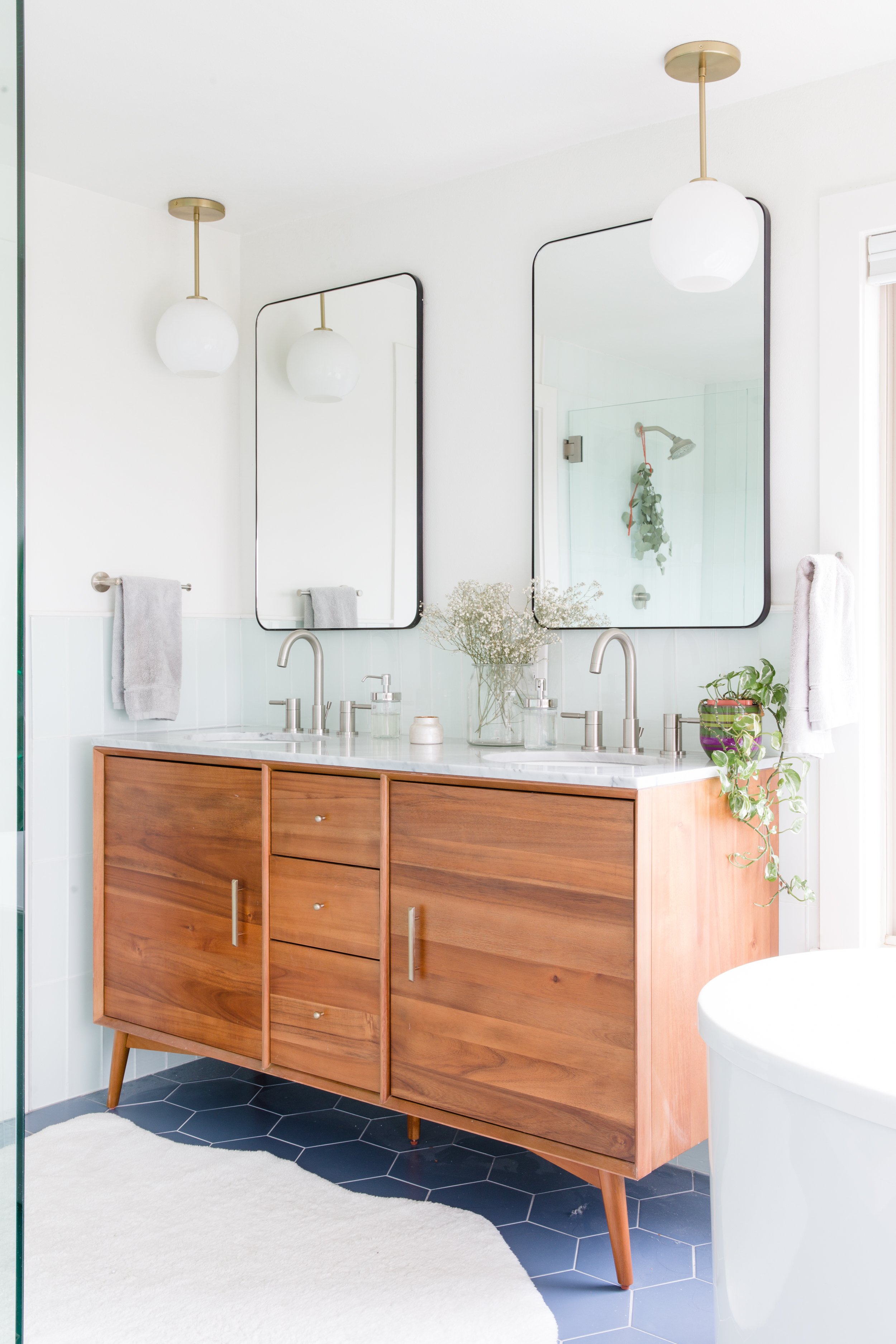
brown wood west elm vanity with marble countertops, round globe light fixtures, black metal mirrors and brushed nickel sink fixtures in a primary bathroom with green subway tile walls and purple hex tile flooring, with a white faux shag rug

Because we were renovating during the pandemic we were affected by delays in product availability and long lead times. This West Elm vanity was not the first we had chosen for the space, but I was actually thrilled we got the chance to re-think our plan when our initial choice was delayed. I love that it brings a mid-century modern vibe to the bathroom and the wood tone is so rich. I am also a big fan of the marble countertop. I always thought marble would be too fussy but I haven’t found that to be the case at all!

white soaking bathtub with silver hardware next to windows with an open view of Seattle and Lake Washington next to a red wooden chair and a fiddle leaf fig plant

I was enormously pregnant during our design and shopping process, so Mike would hop into tub after tub in showrooms to see if he liked the fit before I had to waddle in. We love the one we chose (and probably sat in about 40!).

glass shower with green glass subway tile and brushed nickel silver hardware next to a towel rack with a gold and frosted glass globe wall light fixture
light green glass subway tile soap niche with bottles
green glass subway tile with brushed nickel silver hardware and a spring of eucalyptus hanging from shower head

As for the floor tile? You guessed it, another pivot in choice. We had one picked out that we loved (especially with the first vanity), but became unavailable as well. This purple hex tile was a little bit of a playful spin for us. We solidified this choice when we were in the hospital after our second was born. Literally, I was in a hospital bed when we hit “order.” While we’ve kept much of the house really neutral and classic I wanted to have a little bit of fun, and the bathroom feels like a good place to take a color risk. I’m so glad we did — it really worked with the other cool tones from the subway tile.

We decided to go with the green glass subway tile because we loved the luminosity of it. It also feels a little like a retro pool shower room finish to me, which I love. We continued it all around the room at mid-height.

And for a good before and after, here’s the listing photo! The bathroom now sits in the back third of the space. We have a large pocket door dividing it from the bedroom.

Here is our list of fixtures and finishes:

Vanity lights: West Elm

Wall sconces: Allmodern

Vanity: West Elm

Light above tub: West Elm

Tub: Kohler

Tub filler: Signature Hardware

Vanity faucets: Signature Hardware

Mirrors: Wayfair

Subway tile: Home Depot

Shower floor: Floor & Decor

Towel fixtures: Wayfair

Floor tile: Home Depot

Rug: Ikea

Paint Color: Alabaster - Sherwin Williams eggshell on walls, semigloss on trim