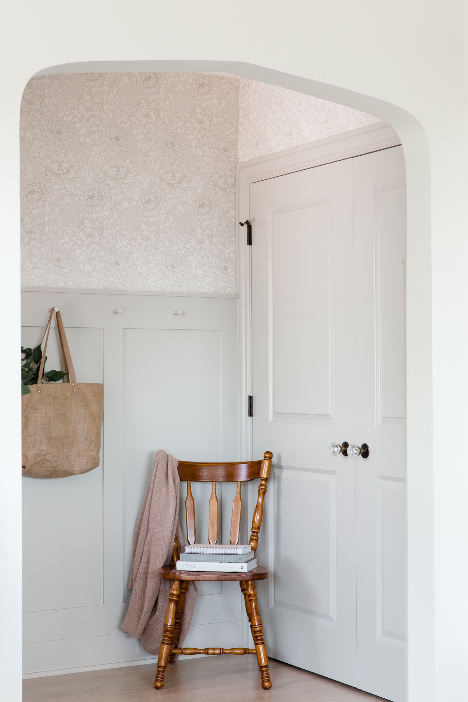
This modern Tudor in Seattle’s Phinney Ridge neighborhood is a spectacular example of what happens when a good design and build team put their minds together to create an entirely new space. I couldn’t believe the way they changed the layout of this residence in every single way, still preserving the historical Tudor aesthetic of the home, but making it a way better place to live for the modern era. I don’t think I could pick a favorite spot, but how gorgeous is that entry?! The wallpaper and painted paneling make it such a great way to enter the home every day, and especially when greeted by sweet Nelson (spot her?).
The design was created by Kallan Nelson of Kallan Interiors. Kallan is highly experienced in residential design and it was fun to pick her brain about her process on this project:
"When our clients came to us needing help remodeling their charming 1929 Tudor home, it was clear it needed quite the overhaul but we wanted to make sure it didn't lose its character. We did this by adding archways in the entry and kitchen, selecting timeless finishes like the entry wallpaper and white oak hardwood floors, and keeping with an overall neutral color palette with the occasional pop of color. The guest bathroom being the exception as we saw this as being a fun area to go a little crazy and add mauve tile wainscoting as this was one the clients favorite colors."
The build was done by RW Anderson Homes, and left no detail untended to. The craftsmanship in this home is top notch.
I was really inspired by the arched doorways when photographing this space. Architectural details like this help delineate spaces and create natural opportunities for photo vignettes. These details create visual frames, making glimpses from room to room an actual picture. In my natural light approach to interior photography, one of the challenges is representing the light of a space accurately as it appears to the eye. This involves some technical footwork in capturing many exposures of the same composition and blending them together in my editing software. This creates a true-to-life impression of the space and honors the way the design intended for light to enter the home.
Hope you enjoy this beautiful project!
Design: Kallan Interiors
Build: RW Anderson Homes
