bright and airy bathroom

Airy Bellingham Airbnb | Vacation Rental Photography

Nestled in the picturesque city of Bellingham, where nature's beauty takes you away from the bustle of Seattle, lies a hidden gem—a short-term rental home exuding bright and airy vibes and adorned with whimsical decor. With lush greenery as its backdrop (it’s surrounded by nature preserve), this charming home invites guests to check out of the grind and into the imaginative state of being that an inspiring and restorative getaway is so good for. This was such a fun home to photograph and brings me to a few key points of a successful short term rental listing photos shoot:

  • Embracing Natural Light:

Photographing a bright and airy home starts with harnessing the power of natural light. In Bellingham, sunlight filters through the dense foliage, lending a soft, ethereal glow to the surroundings. Maximize this vibe by opening curtains and blinds to allow ample light to flood the space. Notice the way that light naturally interacts with the space. Turn off the overhead lights and allow for nature’s light source to take the lead.

  • Composing the Perfect Shot:

To showcase the whimsical decor and the seamless integration with the surrounding greenery, pay attention to composition. Frame the shot to capture the home's unique elements both in tight composition and in a pulled back shot that gives an idea of the full space. Preserve window views by bracketing exposures, especially when they help tell the story of the space.

  • Colors and Textures:

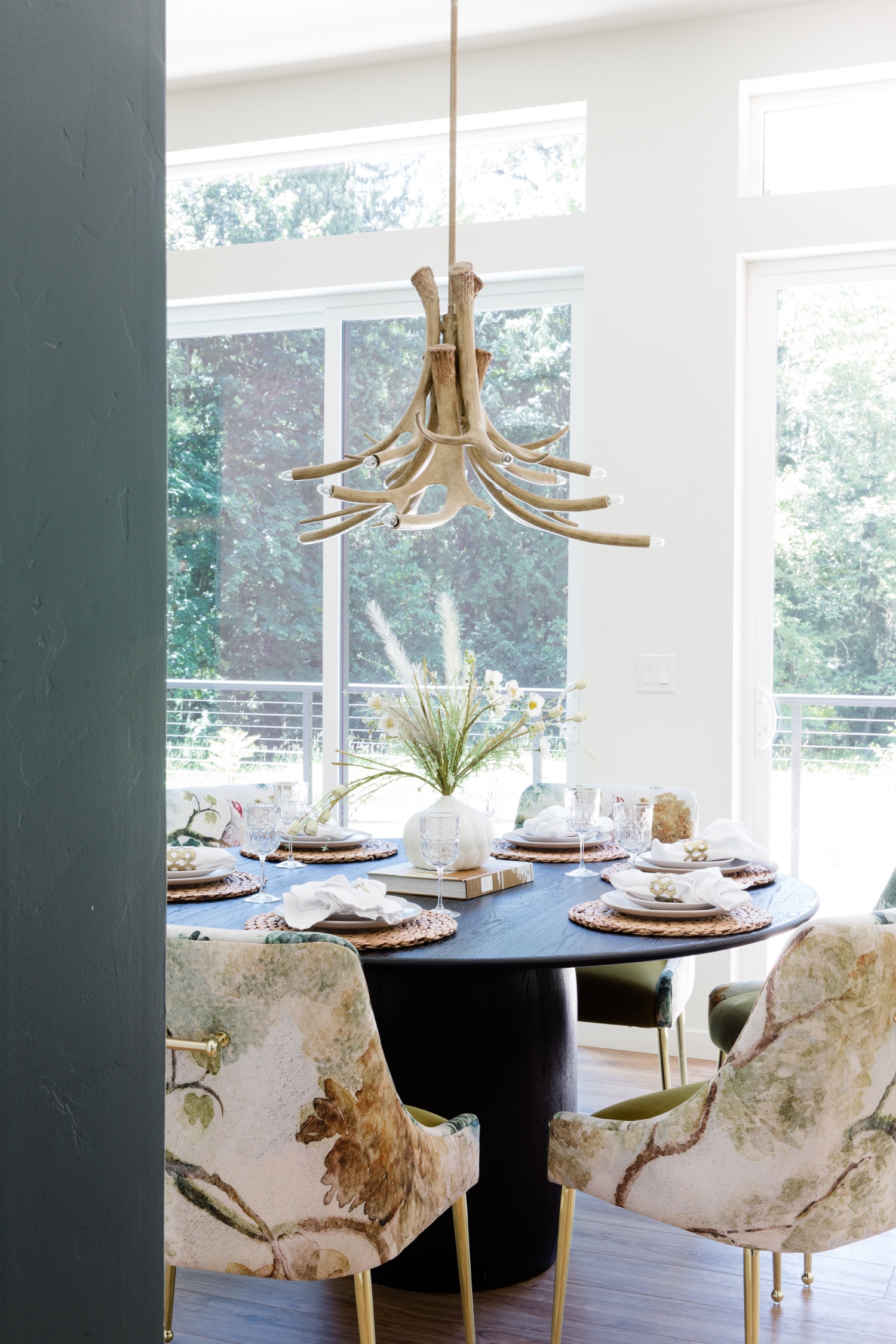
The color palette and textures play a crucial role in the ambiance of this vacation home. Pay attention to the details that the designer painstakingly selected. This house has an amazing juxtaposition of glam and nature, and it’s done really well. I loved the combination of the mirror backsplash with the black marble countertops. In the dining area, an antler chandelier perfectly plays off of floral dining chairs next to yet another pattern in the subtle wallpaper. Incorporating a few of these relationships into a shot brings together the design vision.

  • Accessorizing the Scene:

In order to fully immerse the viewer in the home, a few key accessories help to bring the vision together. Adding in a few small lifestyle elements really makes the difference between photos that feel real estate vs. luxury travel and hospitality. A glass next to a book signifies a relaxing place to read. A blanket over an adirondack near the firepit suggests a cozy bonfire.

  • Outdoor Oasis:

The beauty of this rental home lies not only indoors but also in the enchanting outdoor spaces. Bellingham's greenery provides an idyllic backdrop, so venture outside to capture the magic of the surrounding nature. Photograph a hammock nestled among the trees, the large lawn perfect for active kids and great privacy from neighbors. Incorporating these outdoor shots into your collection will complete the story of this serene retreat.

This is really just the tip of the iceberg of what goes through my head during a shoot, but it gives a solid starting point to plan a successful shoot! Get in touch if you’d like to bring your property to life through engaging, vivid, bright photography.

This house is offered by Gather Vacations.

Contractor: Bellingham Bay Builders

Design: Andrea Zakharoff

You can book this beauty on Airbnb here.

Bathtime Upgrade

After seven years of apartment living in Seattle, one of the things we were most excited about when designing our primary bathroom was including a giant tub. We’re both bath takers and were sorely missing that up to your neck feeling of being submerged in water. It’s so good! We’ve been loving our tub, and now that cooler weather is on the horizon again, I’m ramping up my bathroom situation to create a luxury experience whenever I need it. So, the crusty towels we had for over ten years had to go.

cream pact spa towels next to white bathtub with book and hair clip on a stool next to a fiddle leaf fig plant

This Spa Rib set from Pact is such a fresh upgrade. They’re lightweight and definitely oversized for a full blanket experience getting out of the tub. I’ve always shied away from lighter towel colors out of fear and preservation, but since these are just for the grownups in our little bathroom oasis I felt ready to take the plunge. (Bath pun intended.)

Pact is pretty cool, too, because they’re a completely carbon neutral company.

You can find your own set of towels right here and take 20% off with code EMILYK20. Happy bath season!

Renovation Reveal: Primary Bathroom

This might be the biggest transformation of our renovation project. When we first walked into the primary bedroom we were stunned by the views of Seattle and Lake Washington. We were also really surprised at the size of the room — it spanned the entire back of the house wall to wall, but it shared a small bathroom with the two other bedrooms on the top floor. We knew that we’d be adding a bathroom to the room when we bought the house. It was hard to imagine something that didn’t exist, and there was a lot of taping involved to get the idea of the scale, but in the end I’m so happy with it.

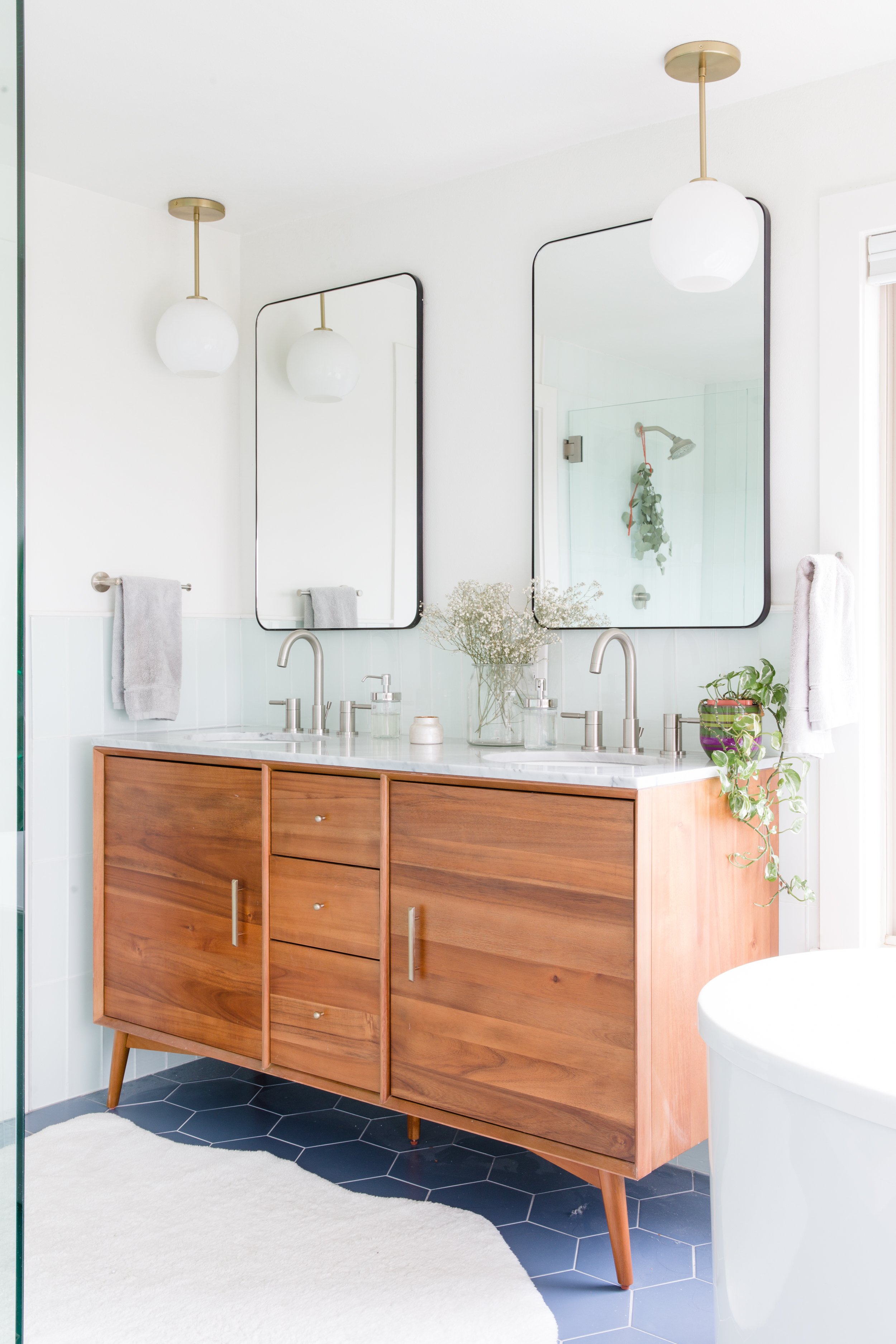
brown wood west elm vanity with marble countertops, round globe light fixtures, black metal mirrors and brushed nickel sink fixtures in a primary bathroom with green subway tile walls and purple hex tile flooring, with a white faux shag rug

Because we were renovating during the pandemic we were affected by delays in product availability and long lead times. This West Elm vanity was not the first we had chosen for the space, but I was actually thrilled we got the chance to re-think our plan when our initial choice was delayed. I love that it brings a mid-century modern vibe to the bathroom and the wood tone is so rich. I am also a big fan of the marble countertop. I always thought marble would be too fussy but I haven’t found that to be the case at all!

white soaking bathtub with silver hardware next to windows with an open view of Seattle and Lake Washington next to a red wooden chair and a fiddle leaf fig plant

I was enormously pregnant during our design and shopping process, so Mike would hop into tub after tub in showrooms to see if he liked the fit before I had to waddle in. We love the one we chose (and probably sat in about 40!).

glass shower with green glass subway tile and brushed nickel silver hardware next to a towel rack with a gold and frosted glass globe wall light fixture
light green glass subway tile soap niche with bottles
green glass subway tile with brushed nickel silver hardware and a spring of eucalyptus hanging from shower head

As for the floor tile? You guessed it, another pivot in choice. We had one picked out that we loved (especially with the first vanity), but became unavailable as well. This purple hex tile was a little bit of a playful spin for us. We solidified this choice when we were in the hospital after our second was born. Literally, I was in a hospital bed when we hit “order.” While we’ve kept much of the house really neutral and classic I wanted to have a little bit of fun, and the bathroom feels like a good place to take a color risk. I’m so glad we did — it really worked with the other cool tones from the subway tile.

We decided to go with the green glass subway tile because we loved the luminosity of it. It also feels a little like a retro pool shower room finish to me, which I love. We continued it all around the room at mid-height.

And for a good before and after, here’s the listing photo! The bathroom now sits in the back third of the space. We have a large pocket door dividing it from the bedroom.

Here is our list of fixtures and finishes:

Vanity lights: West Elm

Wall sconces: Allmodern

Vanity: West Elm

Light above tub: West Elm

Tub: Kohler

Tub filler: Signature Hardware

Vanity faucets: Signature Hardware

Mirrors: Wayfair

Subway tile: Home Depot

Shower floor: Floor & Decor

Towel fixtures: Wayfair

Floor tile: Home Depot

Rug: Ikea

Paint Color: Alabaster - Sherwin Williams eggshell on walls, semigloss on trim