interior photographer seattle

Laurelhurst Renovation | Seattle Interior Photographer

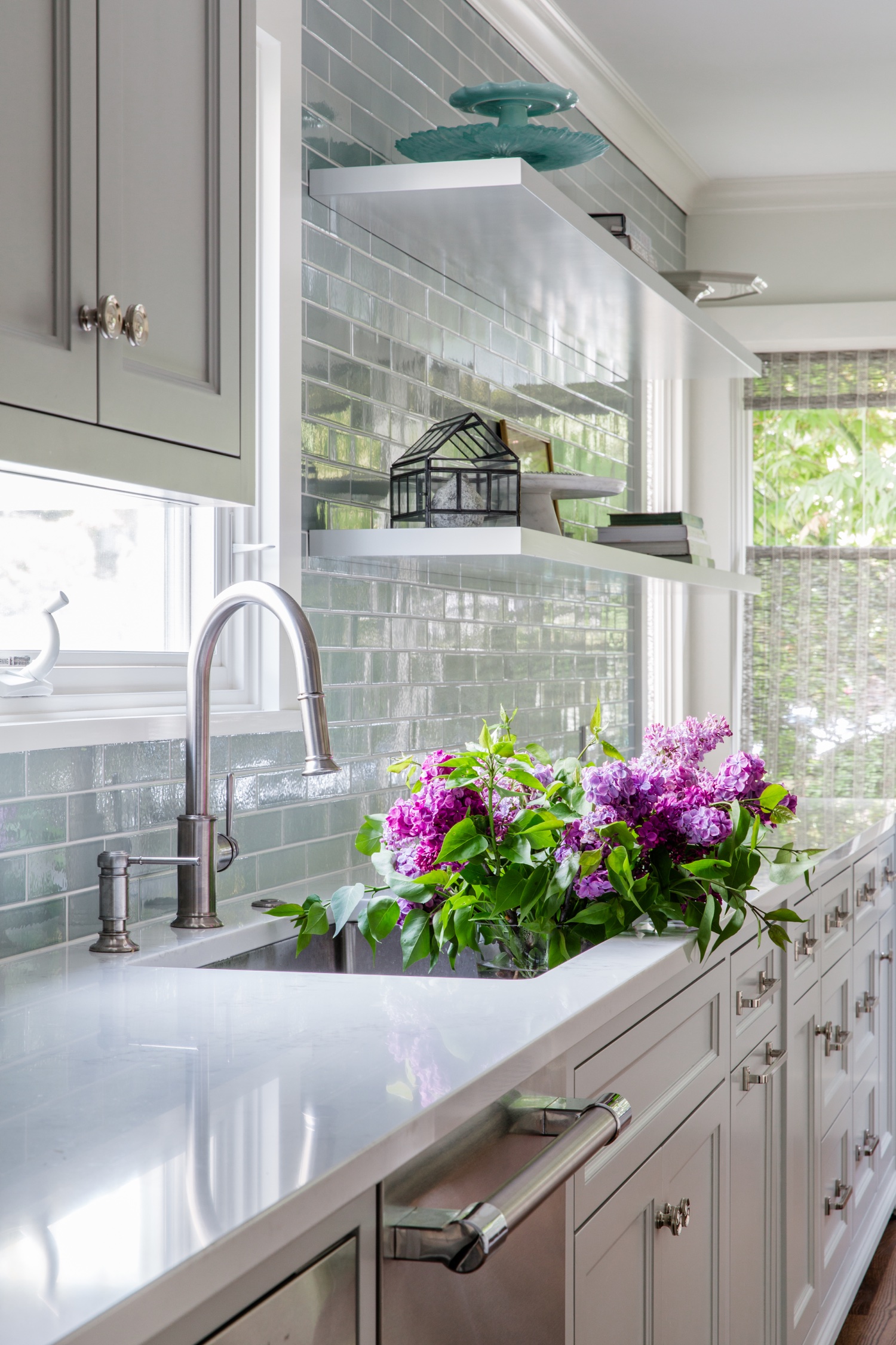
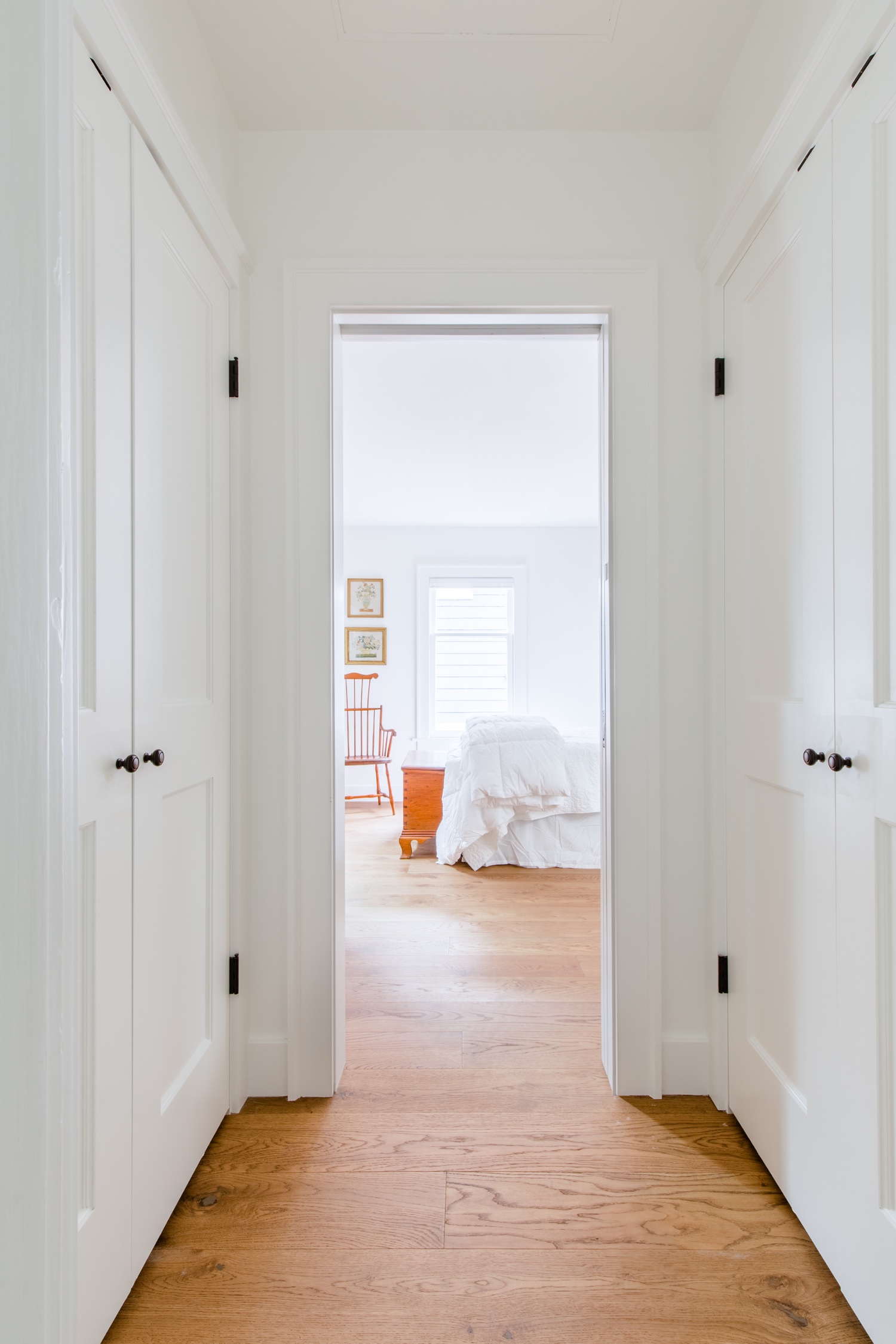
I’m so excited to share this renovation with you today! In one of the historic neighborhoods of Seattle, this home got a full lower level refresh with a new kitchen, living room and dining room. It’s beautifully designed for its resident, a baker (who graced us with scones on the shoot day — they were props and then became our snacks!). I worked with the Seattle interior design team Corr & Steele on this shoot day. A wonderful pair, we collaborated on making each shot just perfect.

My approach to photography is all about collaboration and creativity. I focus on maintaining consistency in my work through careful composition, natural lighting, and elevated styling. The best shoots happen when both my client and I enjoy the process of capturing beautiful spaces. I'm passionate about what I do, and shoot days are always enjoyable. By shooting tethered to a screen, we can make small adjustments to styling and composition, resulting in inviting, editorial-quality images. When it comes to editing, I prefer a clean and natural style, with minimal use of Photoshop tricks. I achieve a bright and natural light look without the use of flash, which I feel makes for a flattened image.

I’m based in Seattle but take projects all over! I was recently in Orange County and Atlanta, and often take photography projects in my hometown of Chicago. The best thing about traveling for interior photography work is seeing how architecture and design styles vary depending on the location.

Design: Corr & Steele

Construction: Darren Patt Construction

Seattle Interior Photographer | Eclectic Architectural Renovation

Like many cities around the US, Seattle is full of amazing old properties that deliver big on charming tree-lined streets and character, and maybe not so much when it comes to square footage. With a competitive real estate market (and a knack for historical preservation), many homeowners are deciding to renovate older homes to create modern, inviting living spaces that cater to today’s needs. With many interior design and architectural firms in Seattle, homeowners can put a little vision into a set of very professional hands for optimal results. In this case, the owners entrusted Office of Ordinary, a women-owned and operated architecture firm to take a small and very divided Seattle home and transform it into a spacious retreat with vaulted ceilings and an open floor plan.

When I showed up to photograph this project, I was floored by the homeowner’s amazing antique collection, including bentwood Colonial chairs and historic French armoires collected over the years by the homeowner, having lived France for many years. As I picked my jaw up off the floor, Office of Ordinary’s founder, Sandy Wolf, explained to me that the space was actually designed to accommodate these pieces. To me, that effort of historical preservation and reverence for antiquity is noble, commendable, and just really super cool.

As an interior and architectural photographer in Seattle, I’ve learned to never rely on sunshine for beautiful photos. Sure enough, on shoot day it was pouring down rain and I opted for a single-trip gear haul, white-knuckling and hunched as I darted from my car to the cozy oasis of the house. By using a tripod and long exposure method, I’m able to ensure the interior photographs are bright, natural, and inviting. Dark days present a fun opportunity to share with my design clients the technical tricks to my work that make changing light conditions just another variable in creating beautiful images. The same rule applies when I’m photographing in the winter months in Chicago — even if the sky is full of clouds and snow, I’ll insist we turn off all the lights and use the powers of long exposures and bracketed images to achieve that natural glow look and feel.

Enjoy this beautiful home and check out Office of Ordinary for your renovation project!

Airy Bellingham Airbnb | Vacation Rental Photography

Nestled in the picturesque city of Bellingham, where nature's beauty takes you away from the bustle of Seattle, lies a hidden gem—a short-term rental home exuding bright and airy vibes and adorned with whimsical decor. With lush greenery as its backdrop (it’s surrounded by nature preserve), this charming home invites guests to check out of the grind and into the imaginative state of being that an inspiring and restorative getaway is so good for. This was such a fun home to photograph and brings me to a few key points of a successful short term rental listing photos shoot:

  • Embracing Natural Light:

Photographing a bright and airy home starts with harnessing the power of natural light. In Bellingham, sunlight filters through the dense foliage, lending a soft, ethereal glow to the surroundings. Maximize this vibe by opening curtains and blinds to allow ample light to flood the space. Notice the way that light naturally interacts with the space. Turn off the overhead lights and allow for nature’s light source to take the lead.

  • Composing the Perfect Shot:

To showcase the whimsical decor and the seamless integration with the surrounding greenery, pay attention to composition. Frame the shot to capture the home's unique elements both in tight composition and in a pulled back shot that gives an idea of the full space. Preserve window views by bracketing exposures, especially when they help tell the story of the space.

  • Colors and Textures:

The color palette and textures play a crucial role in the ambiance of this vacation home. Pay attention to the details that the designer painstakingly selected. This house has an amazing juxtaposition of glam and nature, and it’s done really well. I loved the combination of the mirror backsplash with the black marble countertops. In the dining area, an antler chandelier perfectly plays off of floral dining chairs next to yet another pattern in the subtle wallpaper. Incorporating a few of these relationships into a shot brings together the design vision.

  • Accessorizing the Scene:

In order to fully immerse the viewer in the home, a few key accessories help to bring the vision together. Adding in a few small lifestyle elements really makes the difference between photos that feel real estate vs. luxury travel and hospitality. A glass next to a book signifies a relaxing place to read. A blanket over an adirondack near the firepit suggests a cozy bonfire.

  • Outdoor Oasis:

The beauty of this rental home lies not only indoors but also in the enchanting outdoor spaces. Bellingham's greenery provides an idyllic backdrop, so venture outside to capture the magic of the surrounding nature. Photograph a hammock nestled among the trees, the large lawn perfect for active kids and great privacy from neighbors. Incorporating these outdoor shots into your collection will complete the story of this serene retreat.

This is really just the tip of the iceberg of what goes through my head during a shoot, but it gives a solid starting point to plan a successful shoot! Get in touch if you’d like to bring your property to life through engaging, vivid, bright photography.

This house is offered by Gather Vacations.

Contractor: Bellingham Bay Builders

Design: Andrea Zakharoff

You can book this beauty on Airbnb here.

Seattle Bright White Kitchen | Interior Photography and Video

I recently had the pleasure of styling and shooting a beautiful all white kitchen for Lux Design Builds. It was a fun-filled shoot day, and I'm sure you'll be amazed to see how this kitchen looks anything but sterile or boring! The detail in the hardware and finishes gives it a dynamic, layered look that’s absolutely gorgeous.

My favorite approach to photoshoots is to take an active part in the styling. Not only does accessorizing a space intentionally bring a visual edge, but it adds a storytelling element to the shoot that comes through in photos. I jokingly say that I’ve been preparing for this all my life, but I’ve been collecting unique home accessories since I was a teenager. Pieces that I bring to photoshoots live around my house and are constantly getting shuffled and rotated. I spend time with these accessories and they all have stories.

When I style an interior photoshoot, I look at the space beforehand in photographs and do some pre-planning. I collect pieces into a bit of a mood board and use that as a launching point for the rest of the accessories that I collect. I try to avoid over-planning and allow for some last minute changes once I’m on site on the photoshoot day. I always bring more than I need and make swaps based on the overall chemistry of the room.

A well-styled space will bring your eye through the photo intentionally, drawing the viewer to observe the design details in an authentic way.

Enjoy this beautiful kitchen!

Lux Design Builds does a great job gathering client testimonials (they have many happy customers). This video was created to show off their work and hear from their clients. I shot and edited this video as well! Adding interior design video coverage is a great way to show the space in a different way. I imagine all my favorite HGTV shows’ big “reveal moments” when I shoot video. It should feel aligned with the photos and take the viewer into the scene in a a fresh way.