seattle photogrpaher

Seattle Airbnb | Interior Commercial Photographer

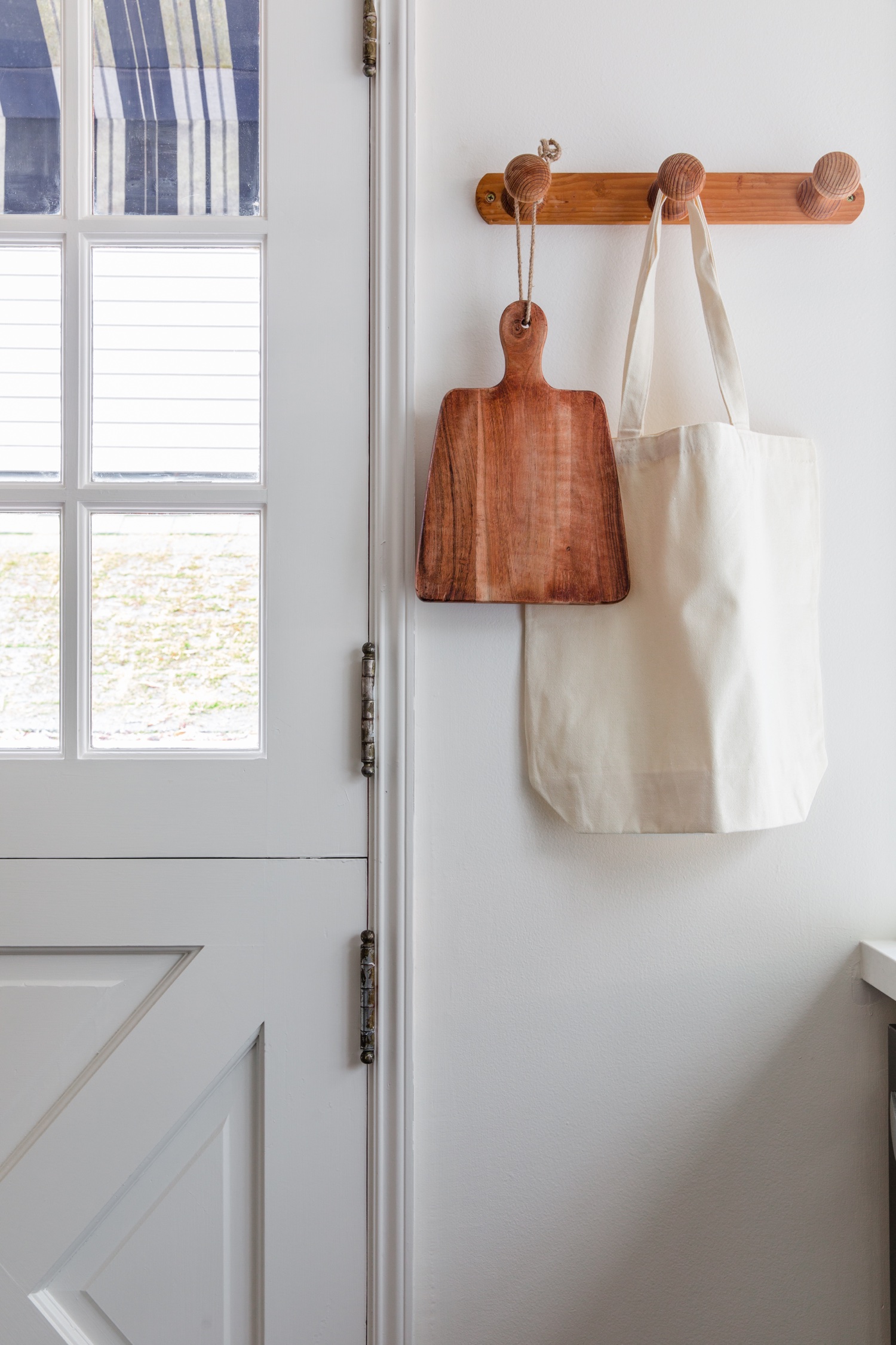
The first thing I noticed walking into this absolutely perfect Airbnb rental home in Seattle was how well the original charm of the home was preserved in its modernization. We love crown molding AND updated heating!

The owner of this short term rental is a master of curation when it comes to vintage and antique items. Nothing is worse than walking into an Airbnb or VRBO and finding wall-to-wall fresh-out-of-the-box decor sourced exclusively from Amazon. It’s not to say that we don’t need convenience in our choices, but I love a collected space.

For one thing, it’s far more sustainable to repurpose items that are already in existence. There are so many good things already out there! Additionally, curating a space intentionally takes a lot of dedication to the overall balance of aesthetic. When we travel, we want to experience a place or a new city, and the place we stay can be just as meaningful as many of the other destinations and activities.

Think back to some of your favorite vacations and tell me if you can recall at least some details about the home you stayed in. In a world with Airbnbs available around every corner, spaces like this totally stand apart.

Of course, the icing on the cake is photographing it intentionally. In over ten years working with people and spaces, I’ve learned about approaching a space with a curious eye and informed skillset. Creating balanced compositions comes from a large background in art, and telling the story through a branding eye comes from many years of experience. I love the feedback I get from my clients when they tell me their space has rented at a higher rate and higher frequency because of their photography. My personal mission is to embody and inspire joy, and this kind of shoot brings me in such alignment with that purpose.

If you have a space you’ve designed I would love to hear about it! Get in touch via email: emily@emilykeeney.com.

Check Your Vibe: Vintage Meets Modern with Revival Rugs

When we bought our house three years ago, we inherently agreed to a pretty hefty renovation process in order to bring it to a livable state.  We never set out for a fixer upper (though we were clocking many hours with renovation home shows).  We actually found the house by driving by it, and when we first stepped foot inside with our real estate agent, it was an exercise in emotional mulitiplicity.  The arches in the dining room, the crumbling floors, the craftsman fireplace, the beautiful windows, the non-functioning kitchen, the crumbling wallpaper, the insane window views.  All of it at once!

We had an offer in by the end of the day.

When we set to renovating, I wanted to preserve as much character as possible while bringing the house to the modern era with its comforts.  Though the original floors were not savable, we installed hardwood that I love.  We kept all of the cool windows and arches, and my absolute favorite spot is the living room with the fireplace that tons of time, effort, and money went into.  

My design aesthetic is very vintage meets modern.  In my mind, I’m always keeping a balance between clean, new pieces that hold up to my family’s use and one-of-a-kind vintage pieces that bring warmth and texture.  (And, always, lots of plants.)

To bring in a finishing touch to this living space, I knew we needed a special rug.  We had a placeholder there while I searched for the perfect vintage Moroccan rug.  Enter the specialists, Revival.  Revival has offices in Istanbul, Casablanca, Mumbai and Oakland, CA and sources vintage rugs that fit their high standards of quality and ethics, and at fair prices.  In addition to their vintage operation, they also produce beautiful new rugs. 

Browsing their collection of Moroccan rugs, I stumbled across this beauty.  It had the warm pinks and beiges accented with pops of blue that I had been looking for.  Truly, it stopped me in my scroll and I just knew it was the one.

Now that I have it in the space, our living room finally feels complete.  I absolutely love the way it feels so soft underfoot, and the texture elevates the room and adds such character.  I really couldn’t be any more thrilled with my whole experience with Revival!  

My first tip when buying vintage is to trust your gut.  I’m a believer that if we surround ourselves with things that make us feel good it will all come together.  I’d also highly recommend measuring your space first, ensuring that the rug is large enough for all of your furniture to have at least two feet touching.  Since you can browse by size you won’t fall in love with the wrong rug!  

Let me know, what do you think of the new look? If you’re in the market for a new rug, Revival is offering a discount code through March 6th: 10OFF-EMILYKEENEY.

Mercer Island Indoor/Outdoor Kitchen Renovation Stunner

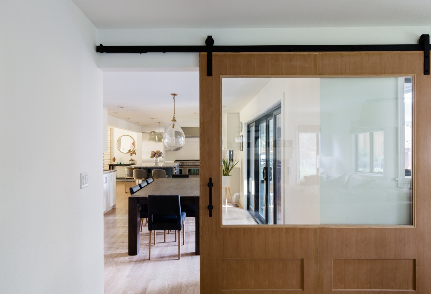
This project is a stunning transformation of a Mercer Island kitchen, dining and outdoor kitchen space, also with a big upgrade for the primary bathroom. Designed by ID by Gwen and built by Bright Work Builders, this renovation offers a spacious kitchen that flows into the dining room and outdoor space with a bright and natural feeling. When I arrived on site, the homeowner had just finished a swim in Lake Washington. Over the course of the shoot I could sense the unity between the design of the space with the lifestyle of its inhabitants.

With plenty of counter space (a beautiful stone!) and a large pass-through window to the outdoor kitchen, this space begs for hosting gatherings and enjoying quality time in the beautiful Seattle climate. The covered outdoor kitchen nearly doubles the footprint of the initial space. Gary of BrightWork Builders explained how the entire roof line was extended to accommodate this new kitchen, though from a glance it appears to have been there from the start.

The kitchen has a mostly white design, with a beautiful blue island to break up the visuals. The glass pendant light fixtures act as the finishing touches and really bring the space to life. A vase of hydrangeas perfectly brought together the tones of the light fixtures and the island, with the slightly gray countertops.

An added bonus to this beautiful project, the primary bathroom got a beautiful upgrade. The blue theme carried through upstairs with a deep cobalt tile with a subtle pattern and all new cabinetry, soaking bathtub and large glass shower stall.

Enjoy this beautiful renovation!